
![I was part of a team executing Parallel's (then factor[e]’s) rebranding efforts. My focus was brand design. The concept of being parallel means that the team is aligned with whoever they work with: between themselves on teams, with their clients, th](https://images.squarespace-cdn.com/content/v1/57914d83ebbd1a83c6bcfdf2/1500828372560-O2GFWS4AD8F8BU56Q7Y5/fullmark.jpg)


Work done at Parallel
Branding
I was part of a team executing Parallel's (then factor[e]’s) rebranding efforts. My focus was brand design. The concept of being parallel means that the team is aligned with whoever they work with: between themselves on teams, with their clients, their community and in the ways they contribute to new technology.
After exploring wordmark options that showed perfect alignment, I recognized it didn't capture the dynamism and constant movement of what it's like to work on a team. Nothing ever goes perfectly the way you think it will, and that's ok, because if you stay the course too rigidly, you miss out on exploring options and discovering even better paths. I skewed one of my aligned concepts and shared with the team who were intrigued by the fact that it was simultaneously balanced and out of alignment. We all agreed it makes viewers complicit in attempting to find alignment and was a metaphor for what they all strive to do every day.
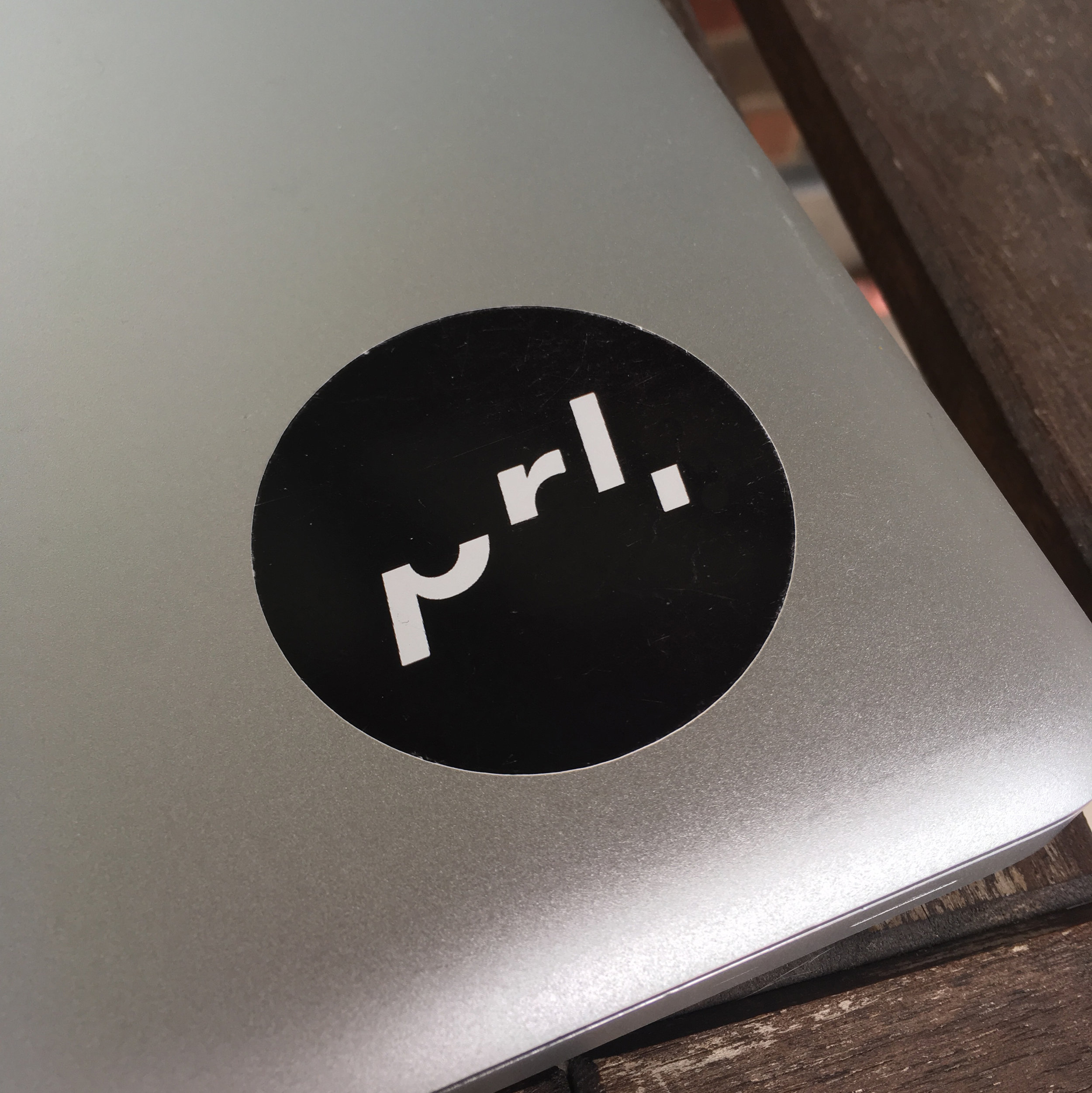
When considering how to communicate the concept of coming to alignment in a smaller supporting icon, I again wanted to challenge and intrigue the viewer into being a part of our story. With the full wordmark, viewers get the benefit of the full word. Here, I wanted them to see the wordmark's most essential parts; broken down into syllables, pa-ra-llel = prl, but I added in the last piece of an l to capture the double l sound in the end of the word.